


Körperkult ...natürlich is an owner-managed store selling sustainably produced goods such as cosmetics, body care, and modern apparel.
The challenge was to create a minimal yet distinctive, and at the same time somewhat playful brand identity that resonates with the assortment and the unusual, unique interior.
Type
Brand Identity
Client
Körperkult ...natürlich
For
Freelance
Role
Conception
Art Direction
Graphic Design
Tools
Adobe Suite
DISCOVERY


Having been commissioned to develop a visual identity for this client in the summer of 2014, the project soon became experience-led. Understanding the concept of creating an overall experience that includes seamless transitions between analog or digital deliverables and the physical experience upon entering the store, helped us realize the necessity of elaborating the intended experience outcome for customers first, before defining the feature sets of these deliverables.
Despite providing precise information during the initial kick-off meeting concerning how parts of the visual identity, specifically the logo, should look, jumping right into creation just didn't feel accurate. I realized that truly embracing the vision of the desired experience outcome and finally crafting it meant physically visiting the store myself during construction, sifting through sketches and discussing the final interior design, thus extending the level of collaboration.
By first envisioning and defining the experience outcome, mutual comprehension was fostered, making it easier to identify key issues in later iterations. This ultimately led to a satisfying result that aligned with the previously defined project goals.
CREATION


01 LOGO
After having a clear notion of the intended not so slick rustic-style store interior, along with its inherent critical statement, starting the design process with creating the logo was a reasonable move.
Inspiration was gathered from elements that relate to this intention: artless growth and decay plus general naturalness, on the one hand, and artificially precipitated decline on the other.
Combining these elements allowed to create a metaphorical arc of suspense that communicates core brand values with a wink.

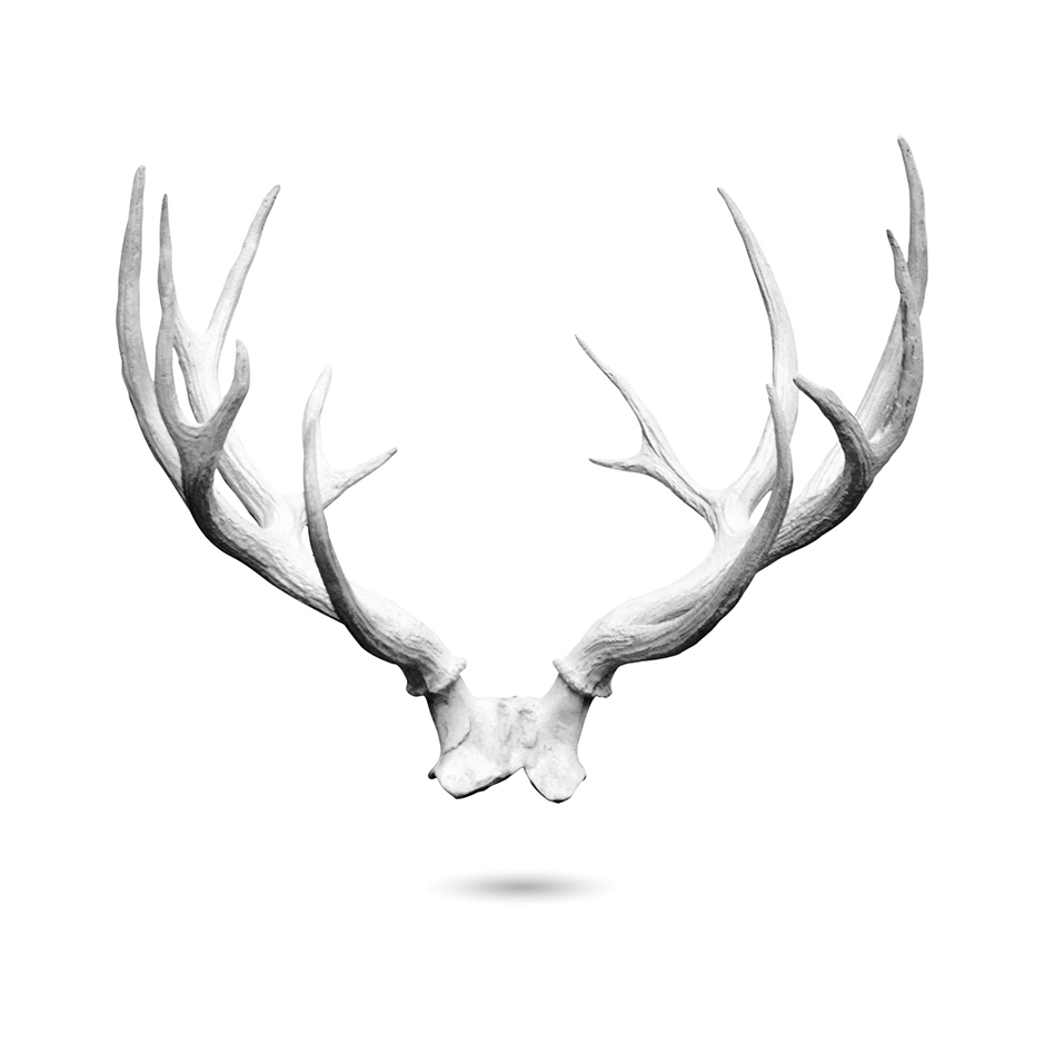

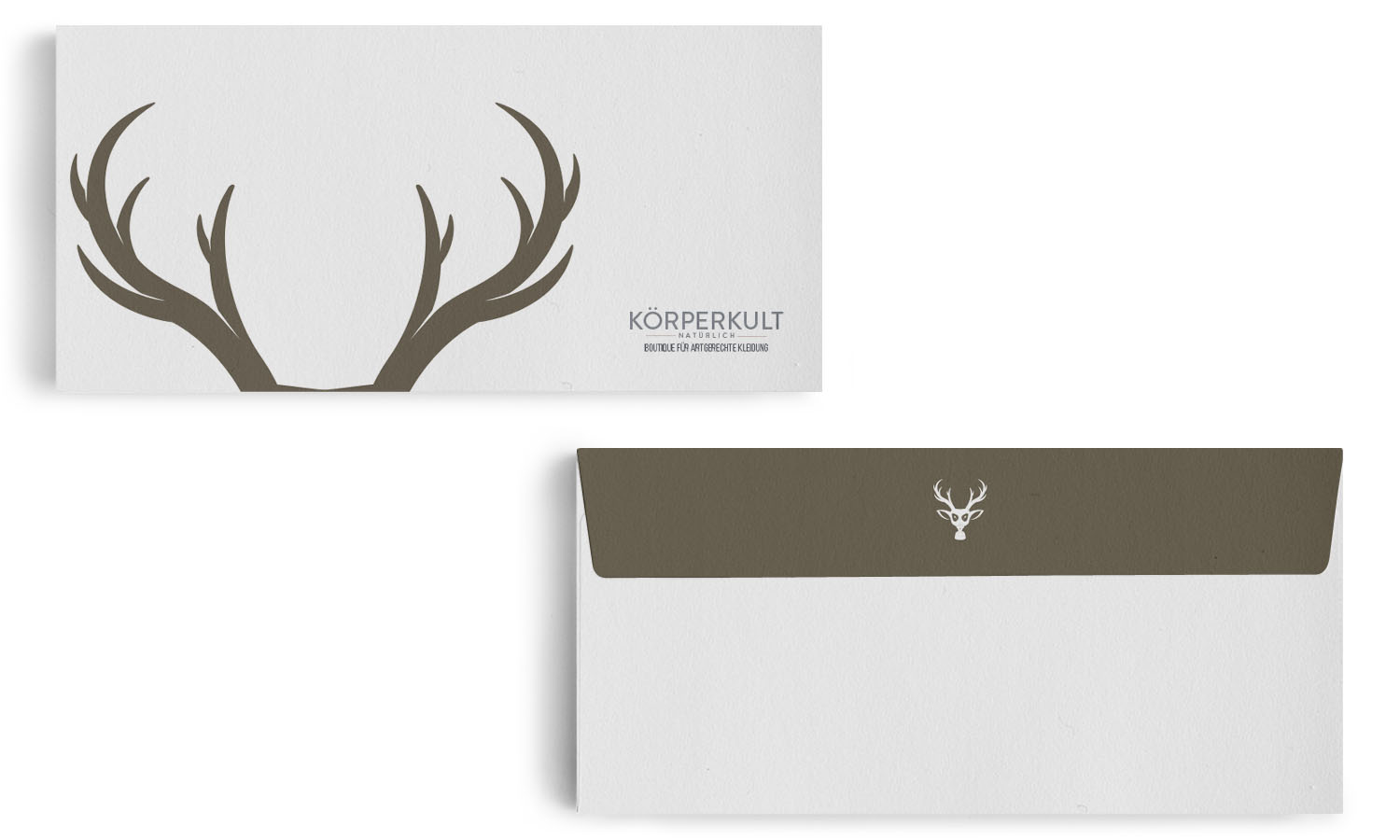
ANTLER SHAPES


HEAD SHAPES


EAR SHAPES


FILTER SHAPES


COMBINING SHAPES
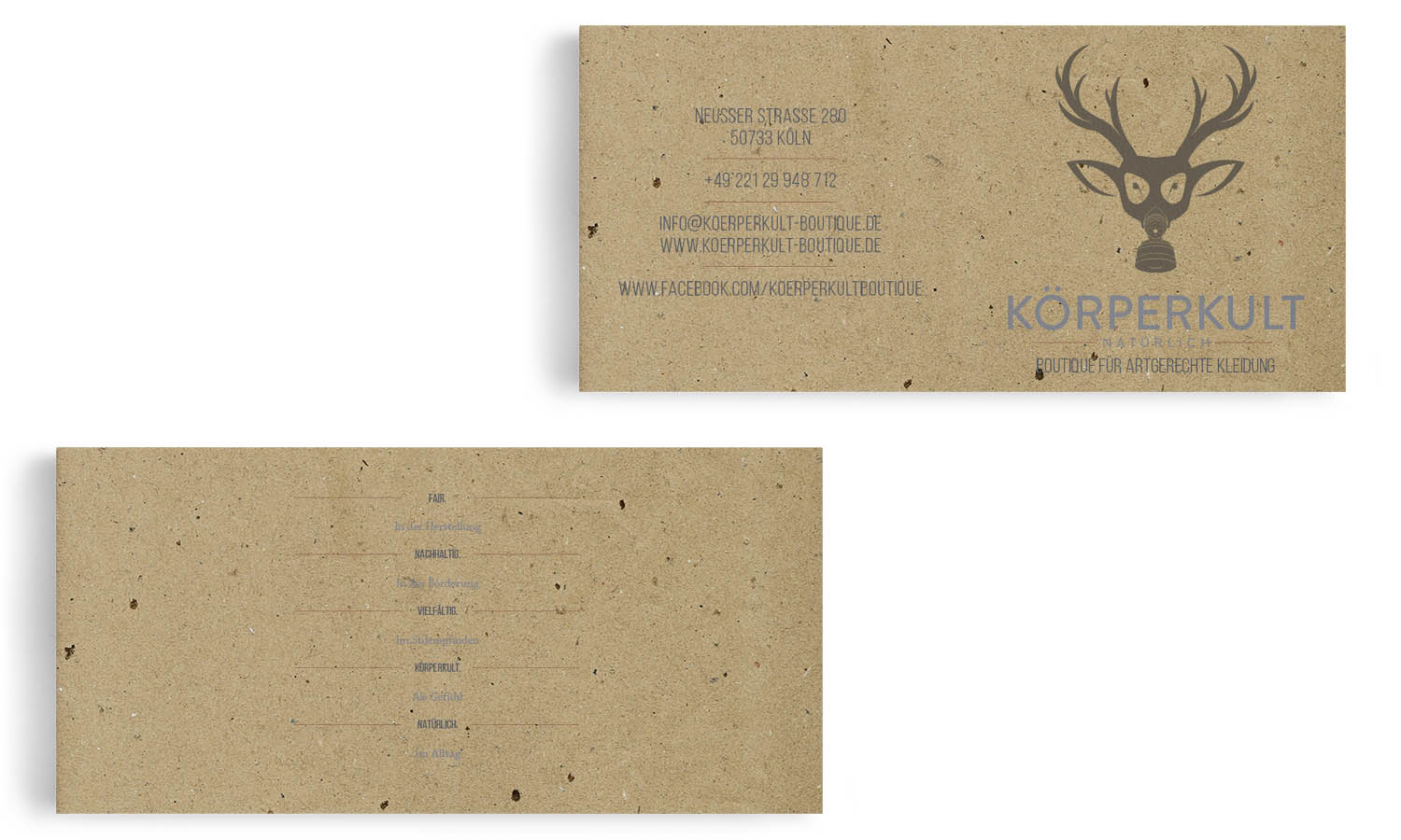
FINAL LOGO
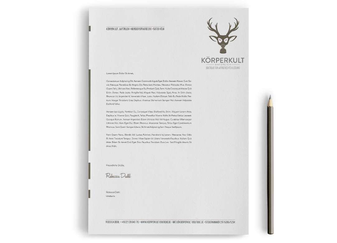
The final logomark evolved from its individual components. With the mask being the most noticeable part, developing an array of elements and merging them afterwards turned out a success.
The goal of creating a logomark that could adapt across a variety of use cases was accomplished, as scaling – whether for shop window advertising or label tags – turned out to work fine as well.
02 COLORS & TYPEFACES
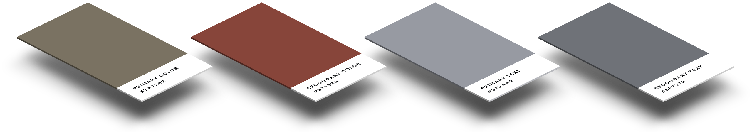
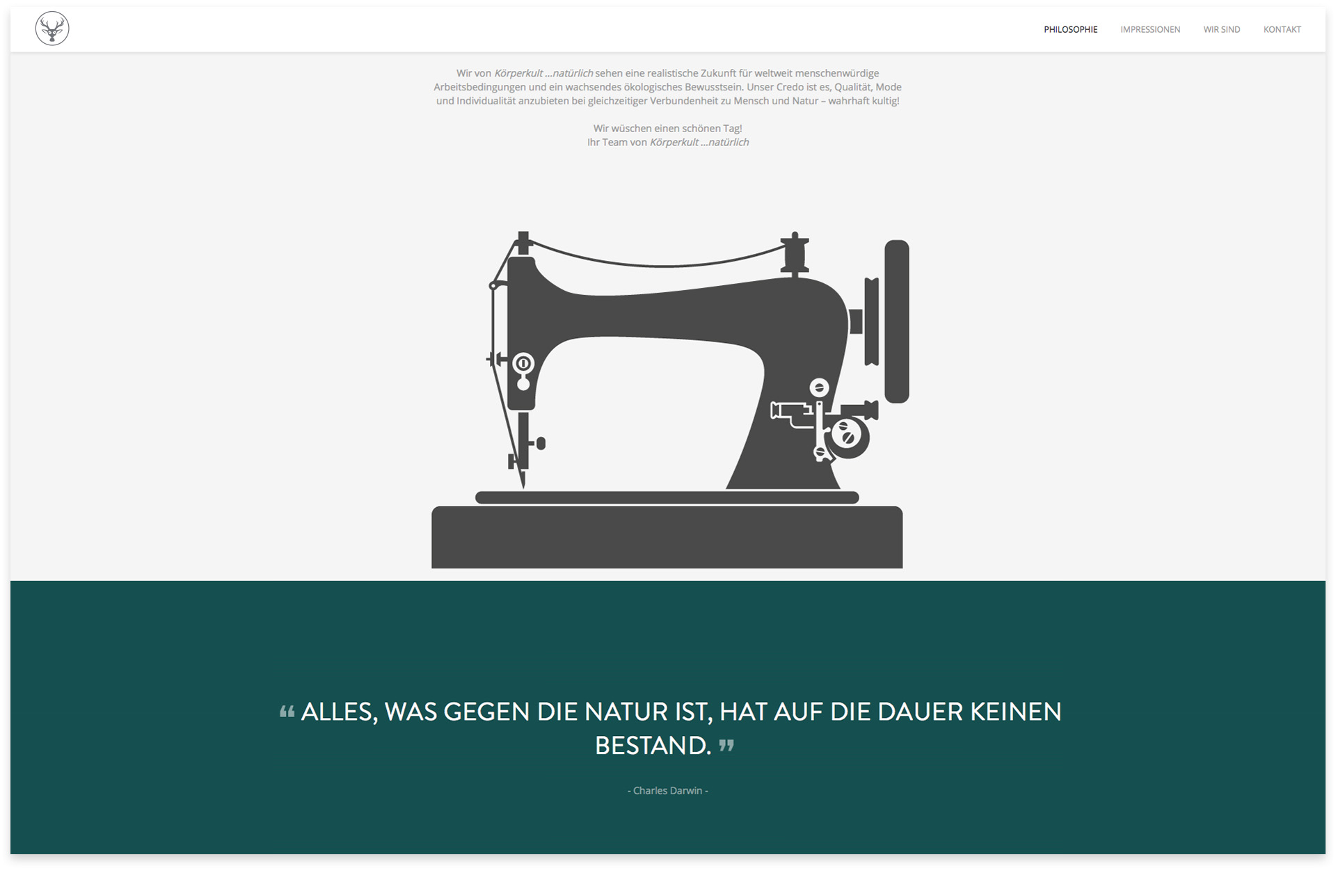
Choosing a color palette with brown as the primary color, representing a calm, down-to-earth-vibe and red as an accent color, adding just a touch of passion, preserved consistency while reflecting the brand essence.
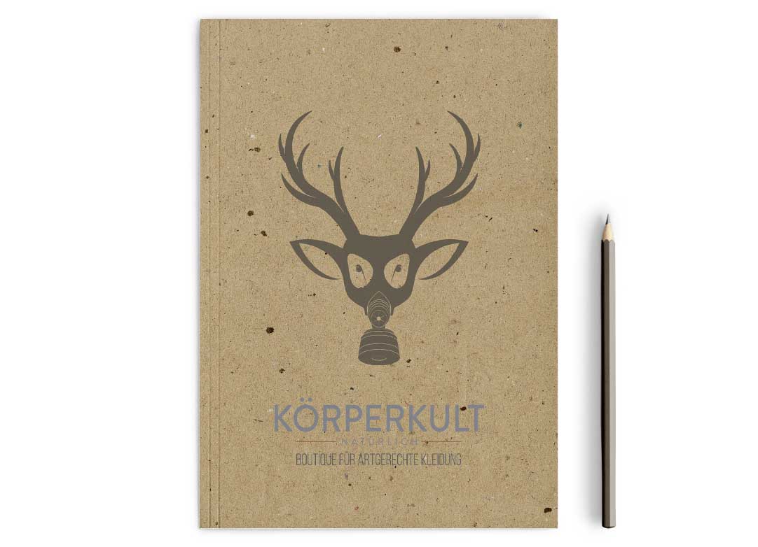
Same goes for the choice of sans serif typefaces: the functional yet warm personalities enrich the overall impression while remaining legible. Furthermore, they blend in nicely with the uncoated kraft paper that is used for printed materials.

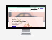
03 WEBSITE
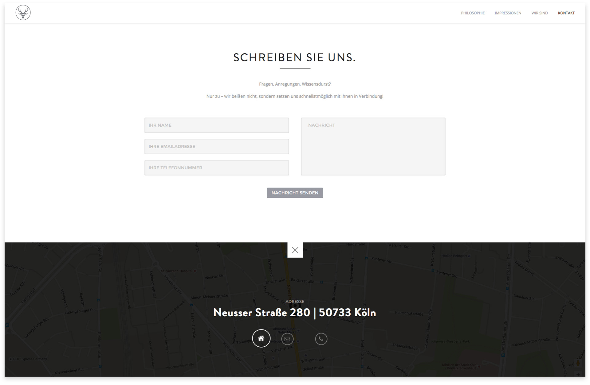
Satisfying the requirement of a simple site maintainability meant selecting a content management system that is both widespread and easy to learn. In this regard, WordPress was the first choice, while corporate typefaces were integrated via a web service.
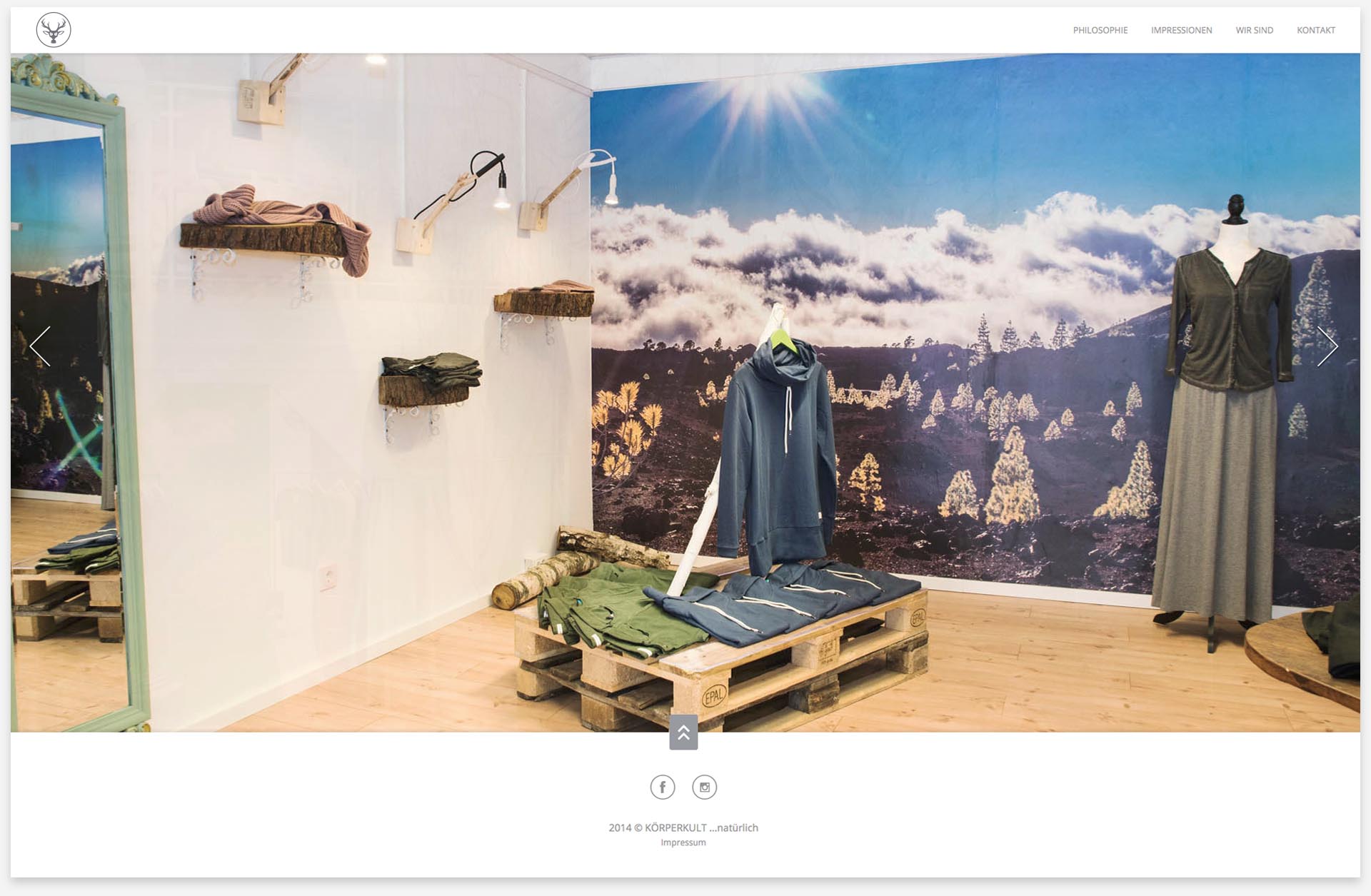
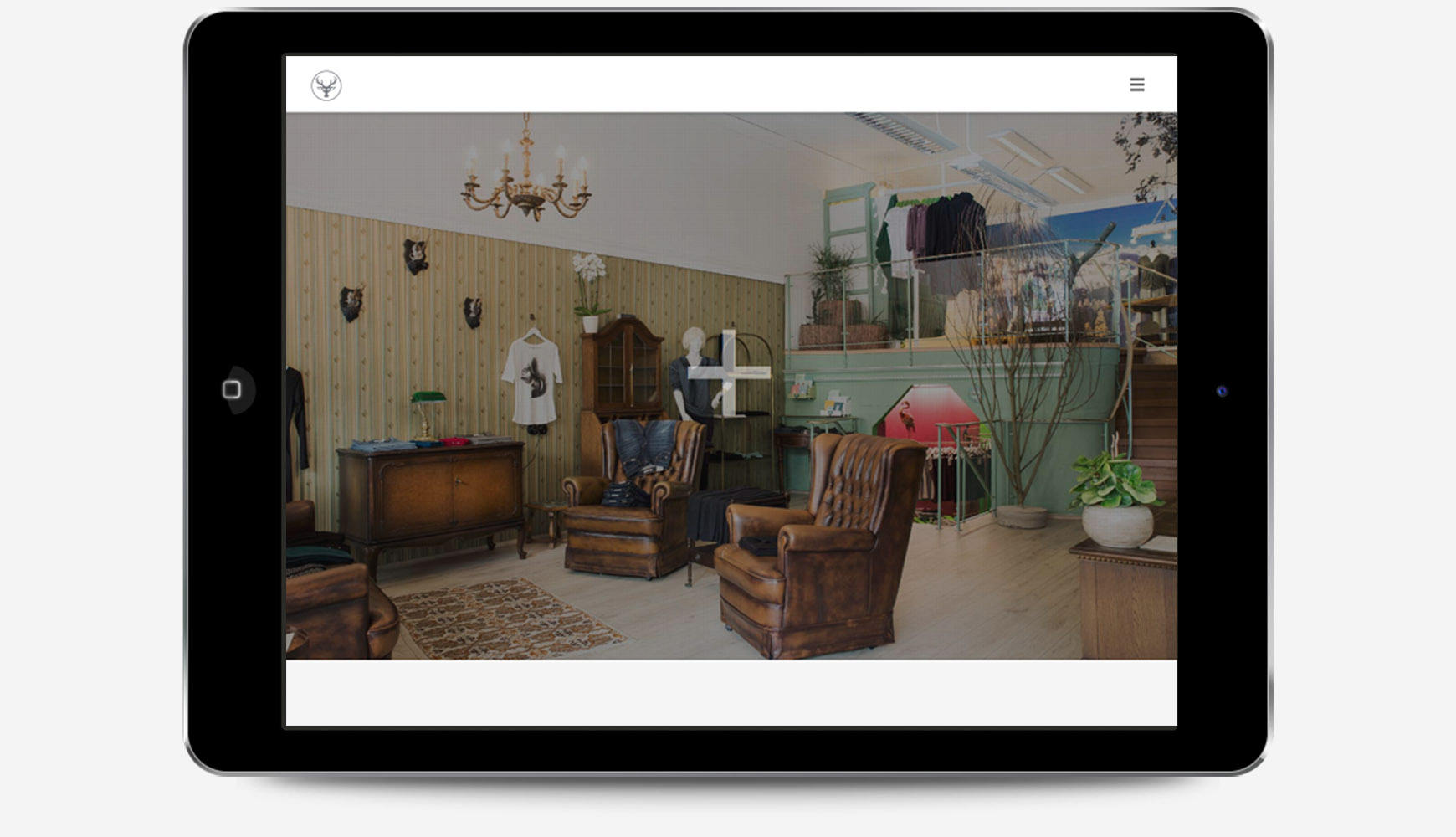
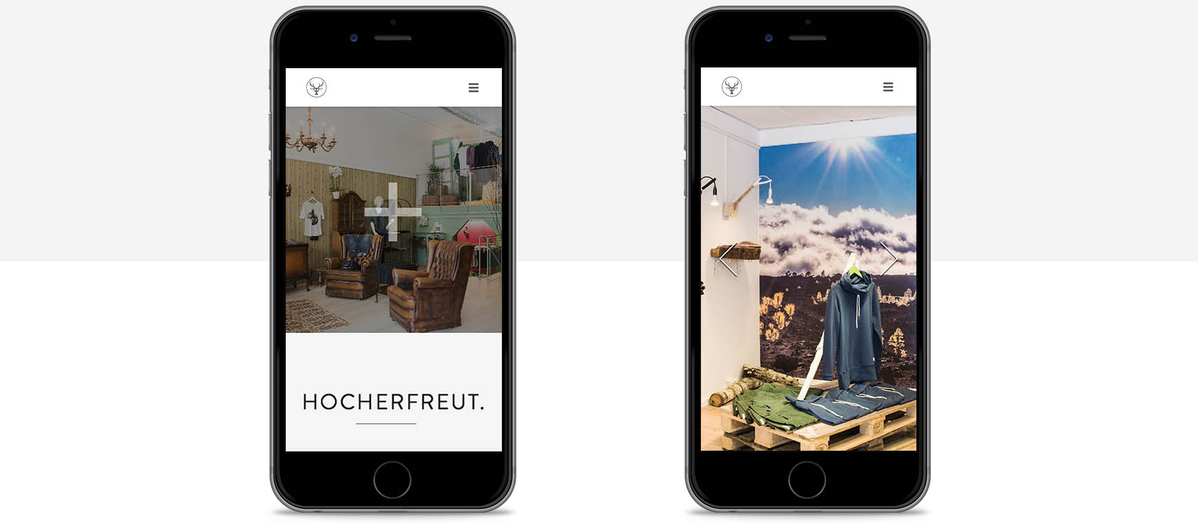
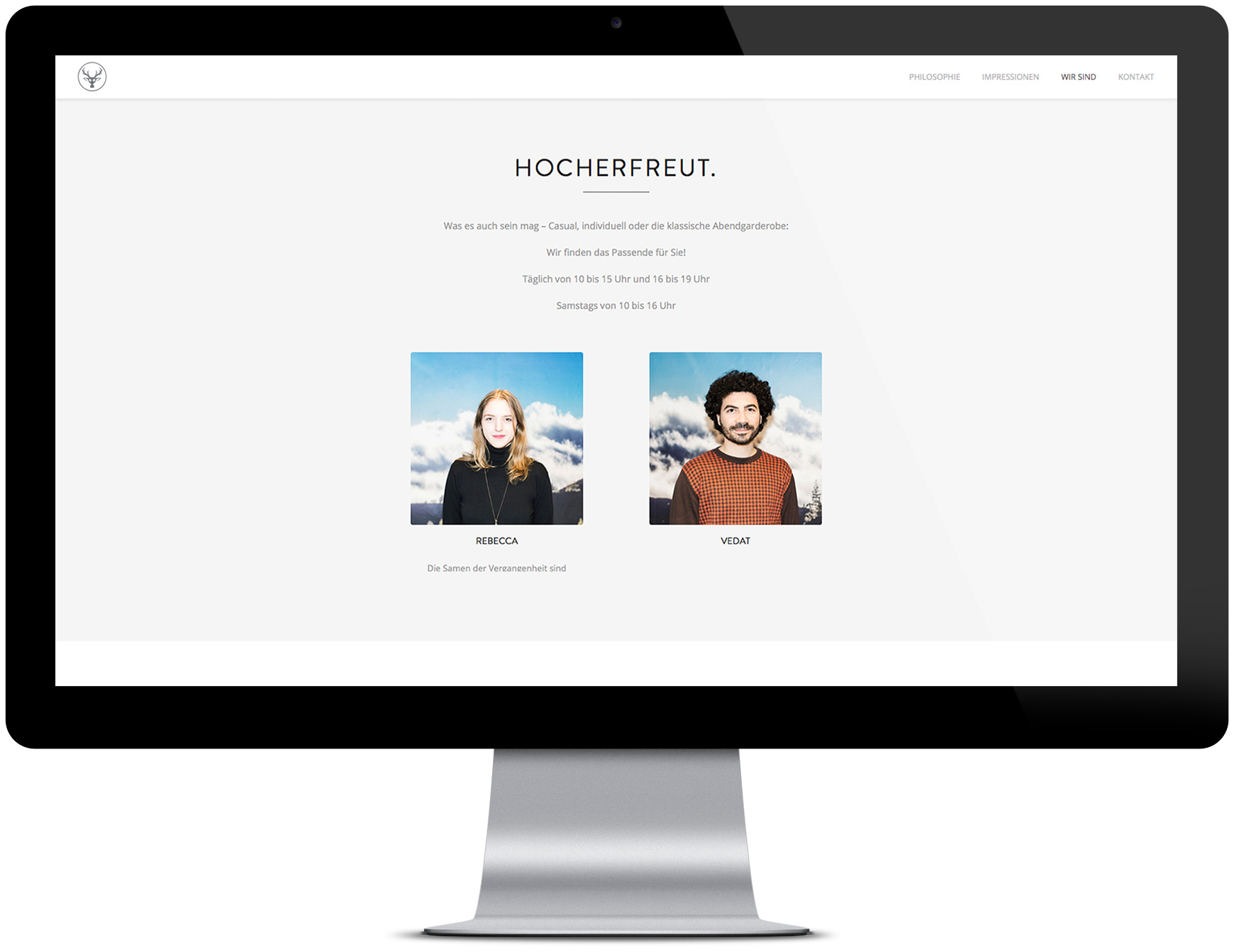
Apart from providing basic features such as contact information or using an API for map embedding and location display, the main purpose of this minimalist one-page concept was to showcase the store interior, with anchor navigation ensuring ease of use.
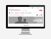
SITE STRUCTURE


UTILIZATION
The solution included previously defined requirements regarding site structure, sectioning content while displaying it in a minimalist, clear, and classy manner.
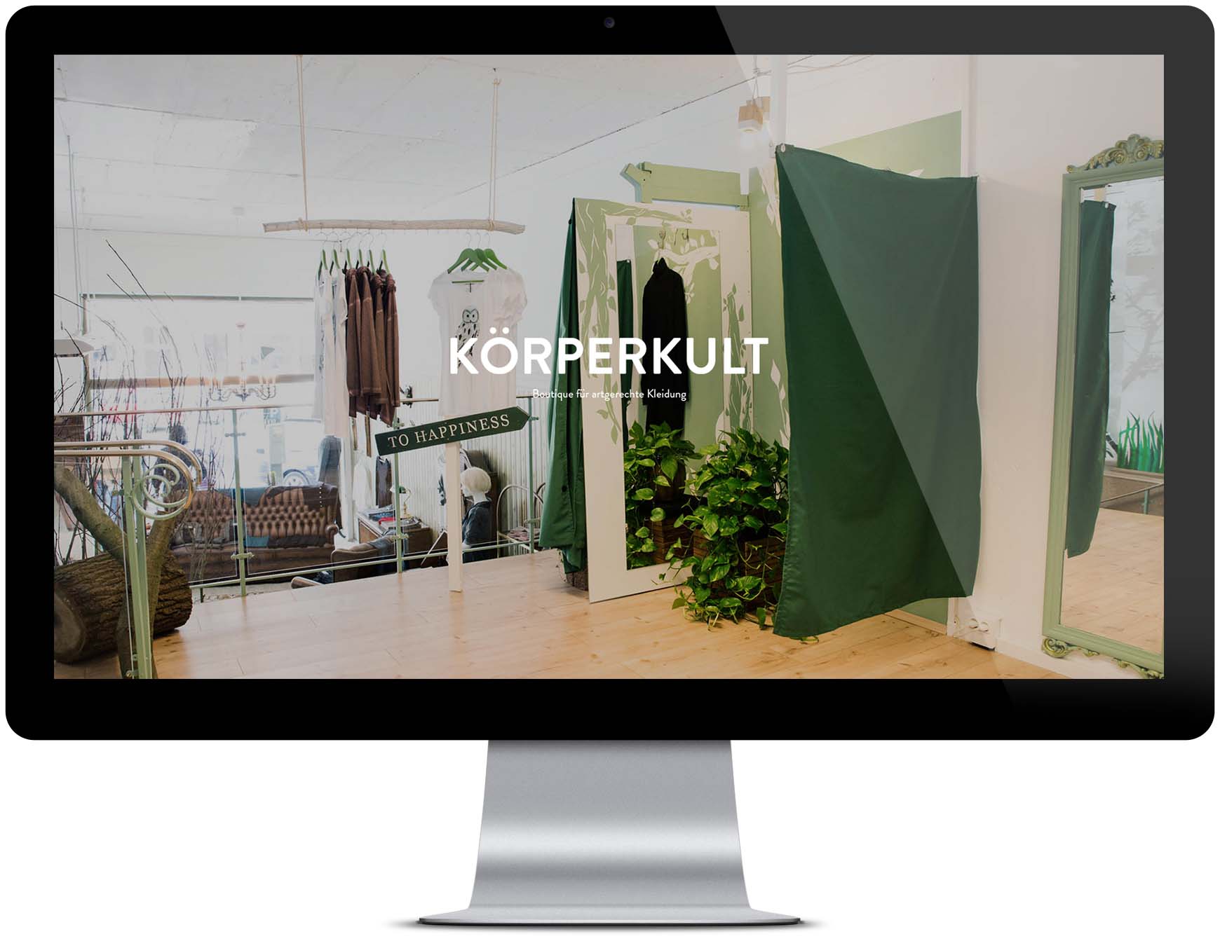
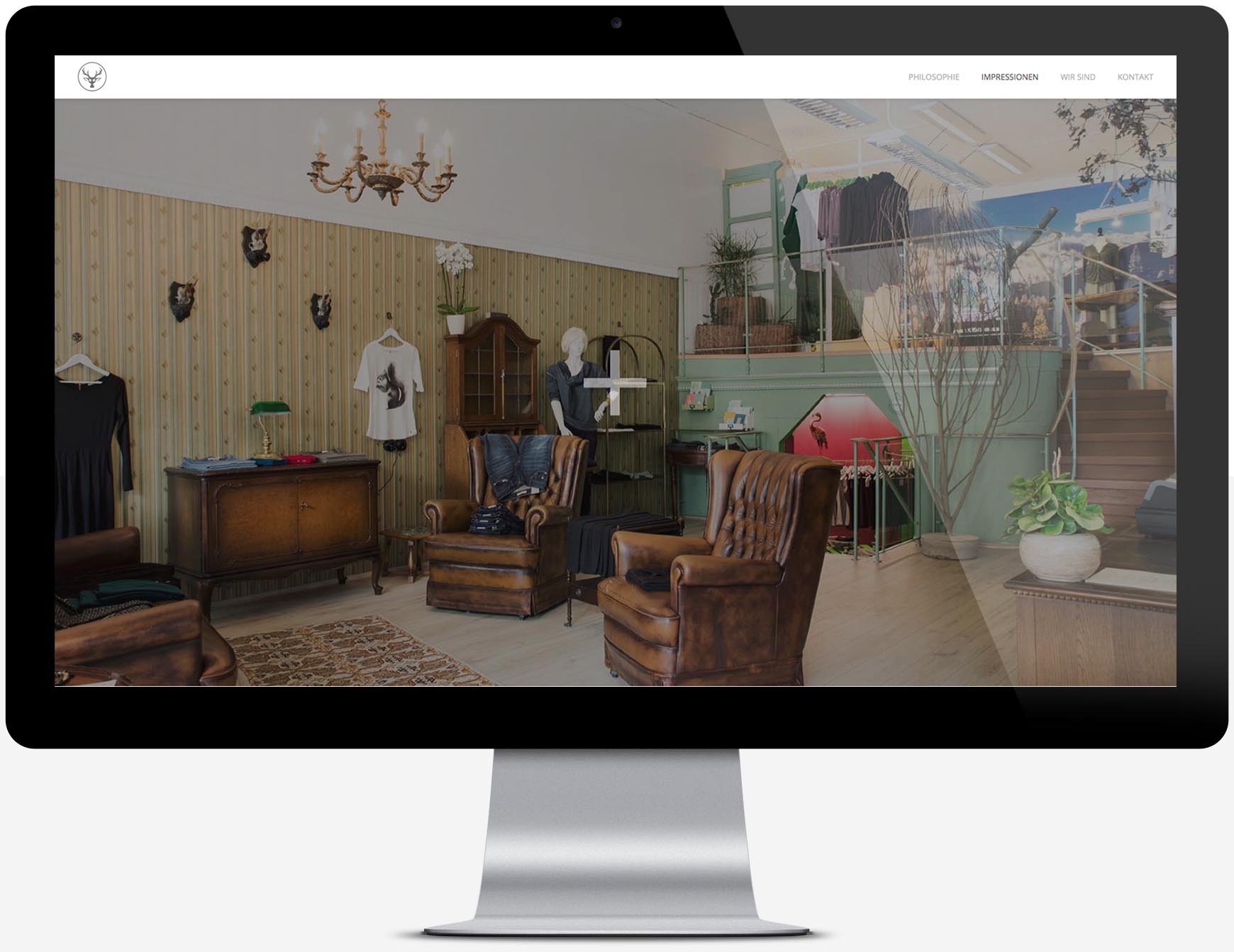
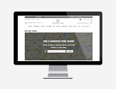
The responsive fullscreen image gallery conveys an impression of the interior, assortment and customer experience when physically entering the store.
REFLECTION
I believe this project turned out to be unusual in various ways. Not only in the sense of a rather close collaboration with the client, but also regarding the degree of attention that was paid to details during the process in order to create a seamless experience for customers.
Synchronizing our commitment and envisioning the experience outcome at first resulted in visual assets that are in line with the brand's core values while simultaneously reflecting its unique character. The great customer reception on store opening verified the adequacy of this approach.
It is just more beneficial to take one step back and contemplate before jumping right into creation.